Friday, May 30, 2008
I think it will work
After trying different things, I think what we have will work. The thing is to go against the grain... no psycho screechy strings. Play it calm, meditative, almost romantic. The temp music helped. I think I'll show this to Ben tomorrow.
Thursday, May 29, 2008
Acting: A. Directing: C-

A real dead bird. Looks fake to me.
Ben finally made it back from San Diego and we shot the bird scene in a little over an hour. Ben did a nice job of acting. His reaction shot was great. For some reason he looks like Harrison Ford in one place. His "looking for the birds in the sky" shot also came out nicely. I give myself a C- only because my job was so tough. I had to shoot around Ben's hair plus I had to use a substitute location. Otherwise, I would have given myself a D. The shots that work, work well. But I didn't get enough coverage. It's making continuity a little difficult and it's making it hard to build as much suspense as I'd like. A huge part of the problem is that I have to cheat so much since we're using a different location. I just can't get the angles I would normally get.
While there Ben found a dead bird. He thought it was strangely coincidental since we were shooting the dead bird scene. I thought it meant that summer is here and West Nile is back. (As a good citizen I reported it to the authorities.) Ben was saying that we could probably have shot the entire desert scene in the equestrian area. I looked back over the existing desert footage and discovered that going to the desert two years ago got us one important thing—sky. The shots have nice big skies, something we just can't get in the city.
The dead crow interior shots are OK, but are too subtle. One thing I'm learning is what it means to control the "size" of a performance or design. I read an interesting interview about the movie Dark Star. The production designer was saying that he wanted to make the space ship look dirty and grundgy, but it just didn't come across on film. Then he worked on Ridley Scott's Alien and when he saw the set, the whole thing look utterly trashed, way overdone. But it came out great on film. Reminds me of the green room which was not grundgy enough so we had to make it worse. If I could go back, I'd make it even grundgier. Anyway, the dead bird shot needs to be bigger with more birds. There needs to be shattered glass everywhere, like a crazy person's room in a car—sparkling, scary, blood, birds and glass.
dead birds & such
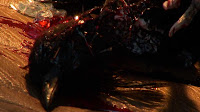
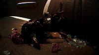
I was excited about shooting today. Right now I'm waiting for Ben to get back from San Diego where he had to put in a court appearance. This morning I picked up the truck from Erik's house then drove over to the equestrian staging area. But as I worked on angles for the dead bird shot, I realized that I could just shoot this at home. So I went home (only about a mile away) and shot the bird in the car.
It was tough. My first attempt at lighting didn't look right. Fortunately, the sun moved and then it looked better. I had to add an extra 500 watts to make the bird visible with the sun blowing out part of the seat but it came out pretty well. The bird itself... it's hard to make a dead bird look like anything. Dan will have to add some bird swarming noises to the shot before. I had some leftover glass from when the shower glass broke and poured on some fake blood. The glass made a huge difference. Without the glass it's not clear that the crow burst through the car window. The fake blood was good too. It looked better than karo and food coloring although that is essentially what it is.
I wanted to get some movement in the shot so I sprayed some haze, but that wasn't visible. I tried a fan, but that wasn't powerful enough. So I just sat there blowing on the bird as I shot it. I used the fish eye so I was right on the bird, literally about a quarter inch away (see above). This is about as good as it's going to get.
For David—final shot info
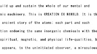
Shot 1. The text of the flyer needs to be readable. At least 30 seconds. Some people walk by like shadowy, indistinct whooshes. It's OK if they're literally shadows but probably the lighting won't work. I think this will work best in flat light. The location I specified will be evenly lit in the afternoon since it faces west. Someone should be fanning the paper so it will move in the wind a bit.
Shot 2. A little farther out. A few more people walk by (of course it can be the same people who do minor changes to look different.) Remember, the clothes have to look timeless and generic. Colors should be very muted so everything should blend together, including all the flyers.

Shot 3. This is the widest you have to go. I found that these shots work better if the flyers/items fill the frame out to the edge. This implies that the flyers go on and on. You can try people walking by in this shot but it probably won't work. They'll probably look too literal. You could try a zoom between shot 2 and 3 but make it so I can just do straight cuts.
NOTES
I think you need at least two other people to shoot this. You need one fan-ner and two walkers (including yourself). I guess you would just frame and leave the camera on.
OBVIOUS QUESTION:
If everything is so filled up, then why is the location so important?
A: It may not be. But I'm concerned about what will be in the negative spaces between the flyers. If it's glass, it will probably look fine. As long as the background is some kind of glass or reasonably weathered brick or cement (weathered urban area) and the lighting is flat, anyplace will probably work. I think!
Tuesday, May 27, 2008
Puppets!
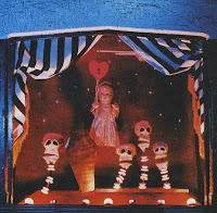
Puppets are like a bridge between theater and visual art. I liked these images from Eileen Blumenthal's Puppetry. Maybe it would be nice to do a film that was sort of like Tony Ousler doing puppets—project actor's heads onto puppets.
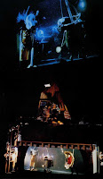
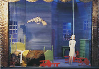
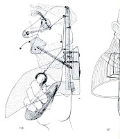
I also liked the mechanism of this puppet. Here, a puppet is a bridge between automatons and visual art. From Hansjurgen Fettig's Hand and Rod Puppets.
Final shot location
Dan's daughter in... Fear House (2008)!
Dan's daughter plays the ghost girl Anna Lisa in this direct-to-DVD horror film.
Producing! (& Ben read this!)
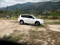
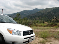
First, before I forget—Ben, Erik says you have the red shirt. Email me if you can't find it.
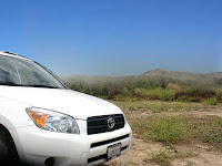
I spent the day producing! which somehow doesn't have the same ring as "shooting" or "editing." Looks like we're going to pick up the desert scene on Thursday in the nearby Equestrian staging area. I always take photos when I look at locations because everything looks so much different on film. I think it's a pretty good match. Here's a rough version of what the shot might look like if I try to get rid of the mountains.
Sunday, May 25, 2008
Getting out early & The Life Aquatic
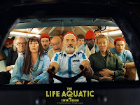
I always seem to want films to end earlier. I liked Iron Man, but if I were making it, I'd probably just have him walking around in the Mark 1 suit for the entire movie. I would have liked Speed Racer better if it ended just before the final race. That would be pretty much the same as the noise film ending. I saw Wes Anderson's Life Aquatic last night. I would have liked that one better without the tacked-on denouement.
The Life Aquatic was nice. It was kind of like The Mighty Ducks (rag tag team of losers make good) with exquisite taste and an enormous attention paid to detail. Maybe less of a movie and more like a massage in which waves of thought and feeling roll over you. I was surprised to find a single film with so many of the kinds of things I respond to—fake sea creatures, theatrical sets, 50's tech machinery, a controlled emotional tone, and an absurd sense of humor. It made me wonder why none of my ideas are heart-warming and life-affirming.
Friday, May 23, 2008
Everyone in the seventies looked ugly except me
I talked to Ben yesterday RE: the Network post. I think that he felt it was unfair to judge films of one era using the standards of another. That's certainly understandable and I hope studios don't de-grain films to make them palatable to Blu-Ray tastes, the present day the equivalent of colorizing or pan and scan. At the same time, there's no question that developments in technology along with the logic of marketing change the way we see the past. So my post on grain was a way of noting that the 'look' of films I grew up watching on the big screen, like Network, no longer seems transparent. This is more than saying that Network, like any cultural product, has aged. Instead, the methodology of shooting at the time: post-studio, but pre-digital, represented a precursor to reality TV. The look was grittier, more spontaneous, less controlled, less contrived. I think at the time these films looked naturalistic, and authentic, a rebellion against product shot on studio backlots. But to my eye now, they look like reality programming—mostly ugly.
Maybe Ben just likes that look. He has this Armenian film that he really likes. I believe he found it in the trash somewhere. To me it looked like an ABC after-school special from 1976, one of those "foreigners are just like us" type movies. In particular what made it seem old (although I believe it is recent) were the camera moves—few dollies, mostly tilts and pans, and the brownish color of everything.
Maybe Ben just likes that look. He has this Armenian film that he really likes. I believe he found it in the trash somewhere. To me it looked like an ABC after-school special from 1976, one of those "foreigners are just like us" type movies. In particular what made it seem old (although I believe it is recent) were the camera moves—few dollies, mostly tilts and pans, and the brownish color of everything.
Youth Without Youth & film grain
I watched the first half of Youth Without Youth today. I was sitting there entranced by how strange it was. It was pure Coppola visually—that rich, old world look. Beautiful cinematography But the picture was smooth and grain free. And there were all sorts of odd effects in it. Like a wave filter here and there. And some squished images. And upside down images. I had to look it up. YWY was shot on a Cine Alta, the same camera used to shoot Star Wars. Tiny $10 million budget. Edited by Walter Murch on FCP. Interesting grading choices. A lot of the beginning of the film is yellowish and orangeish, almost like the white balance is set wrong, but in a nice way. There were a couple of areas that looked video-ish I thought, particularly when faces were in shadows. They seemed a bit red and noisy sometimes. The movie wasn't that interesting to me so I spent most of the time looking at the nice pictures.
That got me thinking about digital technology and how it's changing viewer expecations. You may have heard the chatter about how studios are de-graining films for Blu-Ray. It seems that a lot of consumers are unhappy to find grain on their Blu-Ray movies (just search for "blu ray grain" to get an idea). My first reaction to this was shock, like what is wrong with people? But it started to make sense. First of all, if you're used to watching TV on HD, you're used to seeing a clean, grain-free image. I really don't think HD makes that much difference for a lot of films because of the inherent grain structure. But imagine you're a consumer who bought an expensive TV thinking that HD is supposed to look better. And imagine that you're a studio or electronics company trying to convince consumers that HD does in fact look better. You have the formula for a change in aesthetic right there. This means market forces drive studios to push for a cleaner, grain-free aesthetic in films. This means that Kodak ironically brings about the demise of film by selling film stocks that don't have perceptible grain (which they already do).
This also suggests that there could be another visible rupture in film viewing habits. There's a big gap between black-and-white and color and I wonder if there will be a similar gap between the grainy film look and the digital look? I know it seems unlikely, but consider Network. God, that thing looks terrible. I'm pretty sure it was shot in 35mm, but the opening scene looks like my mind's eye view of 16mm. Probably to kids today it looks like web cam footage. And think about my standby example Heaven's Gate. Even a few years ago, it was a good example of an overdone look-oriented film. But with everything going through DIs and various post-processes these days, Heaven's Gate just doesn't look like it used to. It almost looks more normal than something like Network. When it first came out, Heaven's Gate looked gauzy and finicky. But now that it's easier to get that look with digital grading the cinematography comes across more as an aesthetic choice while Network just looks... bad.
Thursday, May 22, 2008
Impossible cinematography
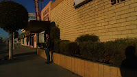
If you look at the bottom right corner of this shot you'll see a shadow of my big head. Why is it there? My only guess is that I was distracted by Sean when we shot this on a freezing cold winter morning. Still it's a pretty big thing to miss. So today in After Effects, I erased the shadow of my head but in doing so, I potentially created an impossible shot. With the camera I used, the only way to get that particular shot with that particular lighting is to put the camera in that particular place—the place where you get the shadow. But the shadow is no longer there. The impossible cinematography in films like Speed Racer is obvious and blatant. But in our film, no one will know that this shot is an impossible one.
Visual effects are often looked at in terms of adding fantastic imagery to a shot. But fx also seem to function subtractively in at least two ways. First, they can be used to make shots viable by removing phone lines, non-period cars, etc. This is a huge deal in terms of the production value it adds. We are now able to simulate having complete (and formerly expensive) control over a location. Second, and perhaps more significant in the long run, shots no longer necessarily bear testimony to the way they were created.
Wednesday, May 21, 2008
Monday, May 19, 2008
Dan, Color's bleach bypass
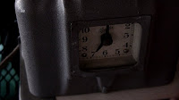
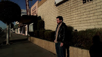
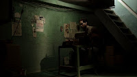
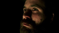
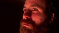
Still tired from everything but especially from being sick and the heat. Talked to Dan for a couple of hours today about the latest edit. I told him that the stars are supposed to be communicating with the satellite kind of like robots talking beep beep beep boop boop boop." He said, "uh, no." Shot the time clock. Experimented with Color's bleach bypass effect. It has a nice transparent, non-grainy quality. I love the way it seems to bring out a greenish color in Ben's crazed and bearded face. (Top 4: graded in Color with bleach bypass. Bottom: original footage).
Sunday, May 18, 2008
More pickups
Ben came over this afternoon to set up the spinner one last time *cough*. We needed the shot where Ben lets the spinner go and we see it start to levitate and spin. An important shot. The first time we shot it, it looked like crap. I lit it poorly. I discovered that ever since I've been trying to light better technically—that is, with more light, everything has looked terrible. So when Ben came back later, we shot it again from a different angle and different lighting. I lit by eye as before so the histogram was too low, but it looked MUCH better. Ben also fixed the time clock and we did a bunch of takes of the voice over.
Saturday, May 17, 2008
The secret behind Hollywood's look-driven blockbusters
One of the big problems of "look-driven" films occurs when they attempt to impose emotion and meaning onto characters via composition, production design, fx and color grading. The film then works "outside in" instead of "inside out." Instead of seeing actors alive on screen, we become aware of an artist behind-the-scenes manipulating the characters from a distance. The characters then become subservient to the artist's heavy hand and the film becomes lifeless and impenetrable (e.g. Sky Captain, Heaven's Gate).
And yet, let's consider 300 which was heavily look-driven but seemed to work on a cinematic and commercial level. What accounts for its success? Well, if you're Hollywood the answer is Frank Miller. But I think there are some specific factors at work. First, 300 (and Sin City) are told using first person narratives and the films' look echoes this narrative. In other words, the "look" is not simply an imposition, but is a visualization of the narrator's view. In 300, this understanding consciously framed aesthetic decisions. For example, the elephants were made larger than real life, as if to reflect the way memory heightens and exaggerates certain details of an event (see Cinefex #109). Further, we might imagine that the misty diffusion of the film serves as an analog to the hazy and heroic quality of memory. It is likely that a "look," like the protagonist of a film, becomes a means by which we understand and "enter into" a film. It has to be derived from a character's perspective and not imposed from without.
If we use this idea to examine Speed Racer, we can see that the film contains an inherent conflict because its look derives not from Speed's perspective but from the directors.' Much has been made of the film's sincerity. I keep seeing this quote from AICN's Moriarty hitting the blogs—
SPEED RACER is a great piece of pop art, but more than that, it’s a genuine, heartfelt, sincere family film that celebrates exactly what it is that defines a family. And if you’re remotely cynical walking in, you will most likely reject it completely.
Yes, the film does come across as sincere but there are different kinds of sincerity. Speed Racer is a love letter to nostalgia and Christmasy visions of toys and candy. But this is a knowing sincerity, the sincerity of an adult looking back in retrospect. When I watched Speed Racer as a kid, I never thought of the show as being super flat hyperreal anime. In comparison to Bugs Bunny, Speed Racer looked real. The world given to us by the Wachowski brothers does not derive from a child-like insertion into a fantasy, but from an adult's sincere, but nostalgic hindsight. In the film, Speed is made subject to this world, not the opposite way around. In typical film thinking, the look follows the emotions of the lead. Peter Jackson, for example, made the Inn at Bree greenish and "urine-colored" not to describe its physical characteristics, but to express its emotional relationship to the hobbits (see DVD extra for LOTR). In Speed Racer, however, Speed is impotent in his inability to shape the unrelentingly colorful environment around him. This gives the film a flimsy presence making it less like a movie and more like an object, a toy to play with.
Speed Racer tanks: the Dukakis hypothesis
Friday, May 16, 2008
Microfiche sequence
I'm now working on animating the microfiche sequence. The microfiche sequence was originally the research-in-the-church sequence which got turned into the research-using-the-portable memex sequence which got turned into the research-in-the-washroom sequence which got turned into the research-in-the-garage sequence. It shows how Ben is putting together the clues that take him from point A to point B. No wonder I'm so tired these days. We really did shoot all those earlier versions, none of which worked.
In After Effects I'm animating a large document with fake microfiche text that scrolls around on screen as if you're doing research. Knowing me you would think I'd want to use a real microfiche reader and you'd be right. But good luck trying to getting microfiche made in this day and age.
I've been feeling tired lately, partly because I've been sick, but also because it takes a lot of energy to do this thing. Here are some of the factors that make our particular process slow and potentially tiring...
1) If something doesn't work, I reshoot it.
2) I go from analog-digital and digital-analog a lot. Just doing simple 2nd unit stuff is time consuming which is one reason why people like to do things as visual effects even when it's unnecessary. It's strange, but even though it's usually faster to just shoot something (rather than doing it as an effect), it's somehow more tiring getting everything set up.
3) Since the film moves amongst different kinds of modes (animation, video, acting, etc.), I'm constantly having to develop new approaches to doing things. For example, the microfiche sequence is the only sequence in which I have to use F-curves (acceleration/deceleration curves). Each of our short animation sequences requires a different approach and technique.
Thursday, May 15, 2008
The Man From Earth (2007)
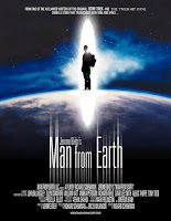
This is the kind of movie that people will typically recommend to me—like The Matrix or Waking Life, but I stumbled across it on Netflix where it's an instant watch. If you can imagine this, it's like a cross between The Matrix, The da Vinci Code and Star Trek's Requiem for a Methuselah (which screenwriter Jerome Bixby also wrote) that takes place in one room, half the time in the dark! The premise of the film is that a professor, ready to move away, reveals to his colleagues that he is a caveman who has been alive for 14,000 years. The idea is reminiscent of the old Twilight Zone episode Long Live Walter Jameson about a similar immortal. Curiously, Jerome Bixby did write a Twilight Zone episode but not that one. He wrote the original story "A Good Life," about the kid who wants everyone to "think happy thoughts."
The movie is well-constructed and a captivating watch. But it stumbles in a number of places. The film is at its best when it poses epistemological questions: how do we know things? What makes a story believable? The film is at its worst when it provides definite answers, from its spurious take on world religions to the final, emotional scene. Worse, is when Bixby goes all Shirley MacClaine on us and links the professor to famous moments in history. Example: when packing, one of his friends says, "Hey, that painting looks just like a Van Gogh...." At least, the professor didn't meet Cleopatra or Joan of Arc. The final effect is something like reading The da Vinci Code. It's engaging when you're in the midst of it, but when you're done, the whole thing evaporates leaving no real trace. The only question that remains is "yes, but where is Scott Bakula?"
Tuesday, May 13, 2008
Waiting for Dan
I saw Dan yesterday. I told him that if I didn't get the music soon I would go to plan B—ridicule him on this blog. I guess I won't have to go that far. He's penciled us in for the end of the summer. His penalty is that he had to listen to me talk about all the changes I made in the last nine months and why.
The Wachowski Brothers' Confessional

The most important part of Speed Racer comes at the beginning. After the evil Royalton tries to entice Speed to join his racing team by showing off his corporate empire, Pops Racer says, "I wasn't impressed. I was intimidated—people with that much money think they can control everything!" That line pretty much sums up the film. Speed Racer is a confessional, a purification ritual performed by the Wachowski brothers to cleanse themselves from the need to seduce and impress audiences with physics-bending photorealistic visual effects. Taking the opposite approach, they flatten and cheapen the look of the film substituting low-tech style for visual intimidation. The idea, like the theme of the Speed Racer itself, is that sheer aesthetic virtuosity can transcend money and power. Says Mrs. Racer to Speed—"when I go to the races, I go to watch you make art and it's beautiful and inspiring and everything that art should be."
However, the visual coding of the film is such that only a highly refined sensibility can tell the difference between a Speed Racer shot and a conventional green screen shot. Speed Racer was shot mostly green screen using a Sony Cine Alta digital camera. But instead of going for realism, the directors and DP David Tattersall deconstructed traditional cinematography using an approach they called "faux lensing." Via compositing they were able to "use a medium-wide lens for the foreground and a super-long lens for the background"—a physical impossibility (American Cinematographer, May 2008). For the Wachowskis this might indeed be "faux lensing" but for the rest of us, it's just cheap-looking green screen shot with a video camera. Speed Racer is a connoisseur's vision of cheapness, the kind only 100 million dollars can buy.
The film is therefore driven by a peculiar ambition. It wants to celebrate the bright, sparkling vitality of child-like vision but it does so through the cultivated eyes of an aesthete. It's like trying to give your five year old pizza from Whole Foods. It looks like pizza, but he won't eat it because it's flecked with radicchio and goat cheese. Unlike Robert Rodriguez, the Wachowskis are just too refined to give us an inexpensive cheap-looking kid's movie. In Speed Racer, the Wachowskis forgot one critical thing. As in The Matrix, audiences probably want to be sucked into a convincing simulation of reality, not gaze at the glossy surfaces of art in motion. In the end, boys are more like Royalton than the super-flat Speed; they want to be seduced by power, not style.
Sunday, May 11, 2008
The Samurai Cop solution
We've been trying to figure out how to shoot an additional scene for the desert sequence even though Ben's hair won't match because he cut it. Cult favorite Samurai Cop (1989), a Lethal Weapon takeoff known for its spectacular and amusing ineptitude provides one solution. During the filming, star (ex-Sylvester Stallone bodyguard) Matt Hannon cut his hair. In order to match the existing footage, Hannon wore a cheap woman's wig.
In the scene below we see Hannon's real hair. This sequence is fascinating in its bizarre use of cutaways and its inability to create risque buddy cop repartee. The only way that this movie makes sense to me is to imagine it as an foreign Lethal Weapon homage film somehow cast in the US and performed in English (Director Amir Shervan shot several Iranian films before coming to the US).
Thursday, May 08, 2008
Production notes-desert stand in
Wednesday, May 07, 2008
Dust Devil = Noise Film
Moody still life from Dust Devil. Noise film starts with one.
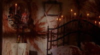
Crazy person's room from Dust Devil.
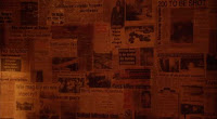
Another crazy person's room in Dust Devil.
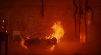
Like noise film, the crazy person's room burns. Only they have enough money to actually show it.
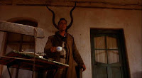
Who set the room on fire? One thing noise film doesn't have is film student symbolism.
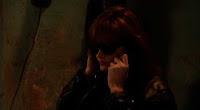
The green wall of this bar is exactly the same color as our green room. If I thought of it, I would have carved graffiti into ours too.
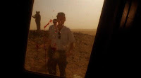
This looks a lot like the previz shot of Ben walking toward the bloody window of his pickup truck (see below).
The red stuff is supposed to be blood on the car window.
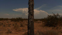
From noise film: a scraggly joshua tree centered in frame in the desert.
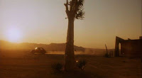
From Dust Devil. The same shot + money + time + skill+ someone to pick up the trash before shooting.
Tuesday, May 06, 2008
Dust Devil
Dust Devil is a gorgeous pre-digital art-horror movie that looks like a big budget noise film. Beautiful, expansive desert shots. Film noir lighting. Peeling green walls, crazy people's rooms, still life-like tableaus, dream sequences and anachronistic imagery. OK, noise film doesn't have a dream sequence but maybe it would if it were longer. Dust Devil also has elements that I hope aren't reminiscent of noise film—atrocious dialogue, structure that goes nowhere, terrible acting, some clumsy directing and scenes that don't play. Director Richard Stanley used to direct music videos in the UK in the 80's so the cinematic lineage makes sense. As someone predominantly interested in visuals, Stanley falls into practically every trap I've written about in this blog. But the film was still compelling enough for me to make it all the way through.
I did feel a kinship with the film's sense of silence and isolation. This is a movie about wide open spaces and individuals who connect only during fleeting moments. All of my film ideas tend to be very similar. Note that in Dust Devil, there are very few two-shots. Stanley shoots conversations by going back and forth between one-ers. That's the way I would do it. I don't think I saw an over-the-shoulder shot in the whole thing.
The acting moments that stood out to me were the unplayable moments—I'm going to commit suicide... no I can't do it... or can I? I'm going to shoot him... no I can't do it... or can I? As I wrote earlier (post), these kind of internal struggle scenes never work for me. They're just so actor-y. The problem isn't the acting. The problem is asking an actor to perform an unplayable scene.
Customers who bought this item also bought....
I found two films that remind me of noise film. The Deep is a short film that played at Sundance curiously under the drama category. It was made by a film student at the University of Utah. Typical low-budget film--no sound, shot DV, no real plot, just a day in the life of someone who lives underground tending to various machines. It's reasonably interesting for its 8 minute running time but by 8 minutes in noise film, we're halfway out to the desert. There's a lot of story in noise film. The Deep is set in that ubiquitous ambiguous future/past universe of which noise film is a part. The one difference is that noise film tends to be more of an electronic-hobby universe. We usually see industrial/steam punk worlds. I saw it on instant play at Netflix so if you don't have Windows you'll have to find it somewhere else.
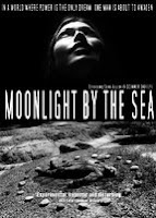
I also watched part of Moonlight by the Sea. When I get a chance I think I'll watch the whole thing. This one is beautifully shot on what looks like b/w film. Low-fi sets, probably made of cardboard. The story is a bit too allegorical for my liking, but there's definitely a sense of artistry at work. Good acting too, better than what you'd expect. Another ambiguous future/past universe, but this one, like Automatons, seems to draw more from the vocabulary of 50's B-movies.
Full speed ahead... sort of
Last week I was doing more tests in Apple Color. I found that the visual effects I had done in After Effects looked terrible because I had done them in a lower resolution. So I re-rendered at full 1080i. About as exciting as buying socks.
Saw Ben yesterday. His solution to the hair problem is "backlighting" which got me thinking yes, it's a matter of the lighting. I don't want to wait six months for his hair to grow out. So either we'll try to backlight him or go with some shadowy lighting or something to disguise his short hair.
David said he'd be willing to produce and second-unit direct the last shot, a tough one, the "Raiders of the Lost Ark" shot. I may try one more idea I have which is to have paste-ups floating into the air. It may get us most of the way there but with less pain. BTW, Ben's idea about the last shot was to have actual, huge cut out letters blowing down the street. hmmm.
This morning I stopped at Hansen Dam park which I see every day on the way to and from school. It looked like it had a dirt parking lot and indeed it did. It will make a great place to shoot the high angle truck shot. I'll need to color correct it to make the dirt look red like the desert.
Sunday, May 04, 2008
How The Monkees ruined America
At the end of the opening theme to the old Monkees TV show there's a line that goes "we're the young generation and we've got something to say..." The Monkees never did tell us exactly what they had to say but it didn't stop them from saying it (or saying something) on their TV show week after week. It's a sensibility that's rubbed off on us today. We believe we have something to say and we should go about saying it, singing it, painting it, or blogging it. Only maybe we shouldn't.
Our society doesn't place a great deal of stock in waiting. But maybe it would be a good thing to wait once in a while. And maybe it would be a good idea to wait for a few months or a few years before making a movie, waiting until one really has something to say.
I guess it sounds like I'm saying that we should all sit around in creative hibernation until something worthwhile bubbles to the surface. That's probably not a bad idea. But another way of thinking about it is to go about one's work, being aware of whether one is exploring, trying to figure something out or really saying something.
Subscribe to:
Comments (Atom)


