Saturday, April 29, 2006

Dining room set


Your honor, I'd like to enter this as "Exhibit A" in the records--dining room set, unlit. Table and chairs to be changed. Hanging light to be removed.

Friday, April 28, 2006

Visual clues


Been thinking about visual clues and codes since I'm still working on the clue that tells Ben how to get to the desert. Some well-known visual clues from movies: Raiders of the Lost Ark--I remember the staff clue as if we can actually see the light traveling from the staff to the location on the map with a laser like noise. I wonder what it really looks like? Then there's the three dimensional clue from Contact where the plans are in 3D, and not 2D. The clue I was originally going to use--map with superimposed symbol shape is too common I think, too 70's, too Zodiac killer. We've seen it a lot, but can never remember where.

I was looking through some conspiracy websites this morning. Check out http://www.texemarrs.com. Reminds me of Erich von Daniken's stuff (Do you know he has a theme park now by the way? Search for "mystery park switzerland" and see the photo above. What's pretty common in conspiracy thinking is the collection of a huge body of folk evidence tied together via mental gymnastics.

So in our film, the clues need to be of that kind--they need to seem to work, but they also need to be more a matter of faith than anything else.

Wednesday, April 26, 2006

Video only an academic could love

Still fine-tuning some of the scenes. One of the problems with this kind of story idea is that it's primarily conceptual. A lot of the "exciting" moments involve reading or doing research--thrilling only if you're an academic. So a lot of fine-tuning has to do with making the ideas more visual (or audible) creating moments specifically for the medium.

That was the idea of putting the shrine in. It's more interesting to visualize history by seeing someone ripping through layers of a shrine rather than just seeing a dusty old gravestone.

My son had "The Grinch Who Stole Christmas" on this morning. They do a nice translation from print to screen at the end. In the book, we are told that the Grinch has a change of heart. But in the video, we SEE the transformation. The Grinch becomes Super-Grinch and holds up the sleigh above his head while he beams. A good video moment created specifically for the medium and not found in the book.

Tuesday, April 25, 2006

For the record: stars & tape recorder


I uploaded these images since I may need to refer to them in the future. Top: Fimo stars (seemed like a good idea at the time). Dan says the current Photoshop stars look like starfish. Below: tape recorder for red room scene.

Monday, April 24, 2006

Production design: key to the future?


(Above: in a battle of control, beauty triumphs over meaningi)

When Mona said that the green printing press set looked theatrical, it got me thinking. Theatrical is not necessarily bad, but it made me wonder what makes a set look "authentic." This is important because in this age of hyper-possibilities, we need to know what makes an image look fresh and alive.

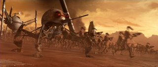
A lot of those all green-screen movies (Sky Captain & the World of Tomoorrow, Mirror Mask, Episode II) have a deadness to them. Everything is just too perfect, perfectly scrubbed and lit. The battle scene in Episode II, for example, looks like an illustration. It doesn't seem warlike, but fantastic and pretty. It's as if having the ability to control every aspect of a composition's arrangement, lighting and color makes artists want to overwork the image, draining the life out.

A recent issue of Cinefx described this problem:

CINEFEX: All of this tweaking--is there a danger of making a shot too perfect, of losing the "soul" of the shot, as Rob mentioned earlier?

ROBERT SKOTAK: I think so. There's an impulse to scrub the dirt out of the shots, to buff and polish them, to perfect nature through the computer. But to make our shots feel more real and gutsy, we have to learn to live with the sloppiness of nature. I'm a fan of the ugly matte shot. Not an unacceptable Matte shot, but a shot that is just ordinary, that doesn't call attention to itself. Or--something Jim Cameron has done in the past is to look for the not-perfeclty framed shot, catching an action that, because it happens so fast, you don't quite capture ideally. There was a nice thing in Signs--the camera comes through a window at a birthday party, and this creature kind of strides by and you don't quite see it. It's a haunting shot.

CINEFEX: We used to hear the expression "happy accident" all the time; but in CG, there are no happy accidents because everything can be so perfectly controlled.

ROBERT SKOTAK: And that's what makes it look wrong. A prime example is the shot of the elephant stepping on the car in Jumanji. In was technically brilliant, very well done. But to me, there was something not quite right about it--and it applies to this idea of perfecting nature in CG. In the real world with real rampaging, out of control animals, that elephant wouldn't step on that car so perfectly. It might just step on the trunk and the car mighit pop up and block the view of the elephant. A part of the car would fly off toward the cameraman, and so he'd duck and the camera would suddenly move to the side....


Production design has become increasingly interesting to me since it's a discipline that has learned to overcome this tendency. Good production design/set dressing is the art of creating artistically believable environments that seem life-like and natural. I'm pretty sure the solution is not to make images look more random. Noise is not the answer, nor is faking naturalistic cliches like handheld camera work, shaking cameras and dirty lenses. (Stealth is a relentless example of this. Note, above, the aerial refueling scene when droplets of gas spill on to the virtual camera lens!) The answer, I think, lies in understanding praxis. What makes something look alive is the way it discloses our engagement with the world--not the technological pleasure of manipulating pixels.

Sunday, April 23, 2006

Library set


Here's a photo of the library at Covenant. It should work well for the library scene. The stained glass in back is actually colorful, just lit poorly here. With some candles and chandeliers and appropriate lighting, it should look nice. It's very small, hence the wide angle.

Wednesday, April 19, 2006

Making video look like film--you mean that's all there is to it? [example clips]

Usually, achieving a film look is seen as a technical problem, a matter of getting the proper frame rate, grain, lack of interlacing, film gamma, etc. This works well for many projects but isn't the only solution. What if you have really bad video to begin with? Converting bad video to 24p just gives you footage that looks like bad video running at a slower frame rate.

Still, I deal with this problem every day with student work shot by non-DPs and with really cheap DV cameras. I've discovered that what makes the most difference in creating a "film look" is not simulating the technical aspects of film literally, but translating film conventions into video post-production effects. Specifically, it means reinterpreting focus, motion and color for video.

[original]

[effected]

Focus

Depth of field is one of the cinematographer's primary tools. It allows the DP to control the eye, to keep it in the frame, or to show what part of the frame is important. Because it's so hard to control depth of field with a video camera, video often looks flat--equally sharp, equally in focus. One way to simulate film focus is to use your NLE (or a program like After Effects) to blur and darken the outside edges of the video frame. This keeps the eye "in frame" and helps the viewer focus on what's important. Of course, film doesn't really look blurred at the edges. But this simple effect performs the same perceptual function as controlling depth of field. And it often makes a big emotional and artistic difference.

Motion

Many people talk about film's dreamy quality. And indeed, simply slowing down video footage gives it a more abstract, filim-like quality. You can slow footage down a lot and not even notice the difference since the film-like quality of altered time seems so intuitively correct. I'm not talking about the entire video here--only selected shots as needed. And of course this only works when you're not shoooting sync sound.

Color

The usual strategies work here--crushing blacks/whites, pushing (or reducing) saturation. Anything to create a sense of richness, depth or contrast.

More

That's it? Darken the frame edge, adjust color and slow down the footage? This strategy often does work. But the basic idea is consider the problem on a case by case basis and not get stuck into thinking about "film look" as a technical concern. This approach won't fool people into thinking you're shooting on film. But that's not the point. The idea is to try to capture the visceral and expressive quality of film.

Tuesday, April 18, 2006

The opaque projector of lost dreams


I love projecting images onto sets and people. It annoys me that computer projectors are so expensive or that I can only borrow one for only days at a time. I read somewhere on the web that you can put an opaque projector over an LCD screen and project it. I saw an Artograph Tracer opaque projector at Aaron Brothers so I got one and tried it. Uh, No. Nothing. The screen was black. The projector does project opaque items OK, but the image is pretty faint. There's just a 100 watt bulb inside, nothing you'd want to shoot with a video camera. And later I found out that the Tracer is available online for half the price I paid. Keep your receipt for returns at Aaron Brothers. And behold the projector of lost dreams.

Monday, April 17, 2006

Welcome to the dollhouse


(click to see enlargement)

Here's the story of the green printing room basement set.

This is really the first floor of Ben's house, but it looks like a basement. The space is actually quite small. If we aren't careful with framing, Ben looks like a giant in a dollhouse. The room was originally white but in July of last year, Krissy and I painted it an eggshell blue that I had custom mixed. I think the wall on the right is still that blue (hard to tell if it's the paint or the gel). The blue was too pretty so I had some green mixed and painted over that. Interestingly, this past week when we went to shoot, it still looked too clean. It's amazing how nice that space looked although it is trashy (and smells of cat droppings). We spray painted all over the wall then painted more green on top of that. Then Erik happened to have some green primer which was a close match to the original green, but not exact. So we used that too. Finally, the wall started to look sufficiently distressed.

We added old electric wire in the background as well as the flourescent light. Everything you see in the shot was added--the boxes, printing press, stuff on the wall. It was like compositing in Photoshop for real! By the way, that wall is old and if you touch it, the cement just crumbles. So we had to use that poster putty stuff to keep everything up. The masking tape actually has putty under it. It's just an illusion. Nowadays, everyone has an "HD is so hi res" story. Here is ours. When I checked the scene at full res you can see that the electric wires just stop on a nail over Ben's head. It looks totally fake. Please don't look hard.

Well, after all that, after a coat of blue paint, green paint, spray paint, more green paint, and green primer, Mona said it looks theatrical because it looks too organized and clean!

Tagline

If you're a student, the three act structure refers to...

1. Film title sequence
2. The movie
3. DVD outtakes

This is a joke. ha ha.

If there were four acts, the last act would be tagline. Here are the ones we've been toying with...

Where myth and reality meet there is noise

When myth and reality meet there is noise

Between myth and reality there is noise

Location scouting by Google


Still looking for a close desert for the shrine scene. Suggestions so far include the Mojave desert (shown above, pic by Erik), Salton Sea, en route to Vegas, Joshua Tree. I'm hoping to find someplace closer, like under an hour away. Friday we checked out the area near Osborne St. in Sunland. The drainage area with the yucca was great but off-limits to cars. I was searching through Victorville using Google maps as a scouting tool. I think that area might work. Still investigating. Everyone here knows what we're looking for. It's just a matter of finding somewhere as close as possible.

Sunday, April 16, 2006

Image grading tests

KEY
>Original image
>Contrast adjustment using curves
>Contrast adjustment using curves + Levels adjustment to orange
>Contrast adjustment using curves + cooling filter
>Contrast adjustment using curves + warming filter
>Curves-high contrast


Friday, April 14, 2006

Spring break and the $10 dolly [video link]

I've been tired so I missed covering a few days of shooting. A synopsis:

Last Friday we finished shooting at the garage temporarily. At OSH I found a couple of furniture casters that were grooved so I bought those, screwed them onto an old IKEA Lack table top and ran it on top of PVC pipe: instant dolly. It will get only a few seconds of usable footage at a time but for that it works great. And it cost only $10.

This past week was spring break. We moved to Ben's basement to shoot the green workroom. The schedule went something like this:

Monday: 4 hours-move equipment, dress set, start lighting
Tuesday: 3 hours-more lighting
Wednesday: 3 hours-more lighting
Thursday: 3 hours-shoot
Friday: scout location for shrine scene

You can see the footage so far (including dolly footage) HERE. (Uncorrected, editd in FCP).

Lighting notes:

Garage: Key: omni with ND gel, Fill: omni w/umbrella
Printing room: flourescent over head, doorway: Tota with 2 lt blue gels, aimed at machine: narrow slit from omni

Friday, April 07, 2006

Do you have Sir Ridley Scott in a Can?

I realize that I've been obsessed with getting smoke effects. First there was the DJ fogger that didn't work too well (smoke dissipates too quickly). Then there was the shoot last week in which Ben smoked so many cigarettes that I woke up the next day with a sore throat. Then a few days ago, I found a product called Fantasy FX haze in a can. So I ordered a couple of those ($10 each + shipping). It's a non-toxic, CFC-free (so they say) spray that's supposed to create a haze in the air for 30 minutes. We'll see. It's made specifically for theatrical/film use. By the way, you better let him out!

Wednesday, April 05, 2006

Whither theatricality

The longer we work on this, one thing is for sure--this looks more and more like a regular film. If you remember long ago this was going to be more like a taped theater piece, very abstract. Then I was going to shoot everything flat and stage-like. Now the most recent shots look more or less like a regular film.

Part of this has to do with making this thing easier to produce. Just getting the narrative working is enough of a problem. Part of this also has to do with rediscovering what film people probably already know. When I light and edit the footage too flat, too much from the front, everything looks small. It feels like we're shooting in a garage (which we are). When I start moving the camera around the space feels much bigger. When edited flat, the piece doesn't seem slow and sculptural. It seems a little disjointed. Changing angles seems to propel things forward.

It's also interesting how different the shoot is when Erik is there. Last Friday, we were sort of like an organic unit with Erik aiming lights by hand and me moving the camera. We got a lot of arty shots. Monday night, we also got good shots, but less arty stuff.

Tuesday, April 04, 2006

Some footage from this week

This isn't really an edit--just some of the footage we shot on Fri. and last night. I'm really happy with it so far. Output via the Sony's built-in DV conveter from HDV to SD. No color correction. Captured and edited in FCP. [VIEW]

Monday, April 03, 2006

Illustration v. Expressionism

I'm now thinking that the Photoshop manipulation looks pretty good except it kind of looks like a breast. I've also been thinking about this listening idea that we've been discussing for the past week. I think it's similar to the difference between illustration and expressionism. Illustration requires that you follow a comp and then refine it. Bad illustration "dies" during this process; like most stamps issued by the Post Office, the artwork just seems lifeless. But good illustration retains its liveliness. Expressionism, on the other hand, is a language of improvisation. Good expressionism is no livelier than good illustration, but it is a different approach.

Thinking along these lines, I'm wondering if it's possible to engage in more expressionistic tactics. One of the things that's fun to do in a picture is to allow your work to go bad and then rescue it. In film this might look something like Moulin Rouge. The whole film is massaged and tweaked. It looks like thousands of tiny film fragments speeded up, slowed down, and otherwise rescued. It's as if editing was the process of 'fixing' improvisational footage to make it work within the overall context of the film. Not 'fixing it" in post, but 'rediscovering it' in post.

Shot again tonight. I overslept again so we didn't start till 11:30. The casualty this time was Erik... I didn't want to call and wake everyone there up.

Maybe I'm barking up the wrong tree?


Maybe I should just do some photomanipulation? I thought this doesn't look bad. Keep in mind that this is going to be visible for a few seconds at most.

Sunday, April 02, 2006

Stars example


This is what I'm trying to make guys. Any ideas? They should look crystallline/clear/transluscent. Size doesn't matter since it's just a still image.

Saturday, April 01, 2006

Here we go again...

The gelatin stars were a failure. They looked like sea creatures--kind of like a cross between a jellyfish and a starfish. They were actually remarkably organic and slimy looking. But that's not what I was after. So I took one of the molds and tried making ice. The result: a star that looked like it was made of ice. Hmmm.

Let's think about this again. These crystalline stars are supposed to look a lot like traditional five-pointed stars. They need to look organic as if they were grown out of crystal. Yet they need to look very close to our stereotypical image of a star. The idea is that matter somehow crystallizes around the contacts of the spinning machine and takes this unique shape.

I had the idea of growing crystal. If I can get some tiny crystal pieces and then 'surgically' alter them or stick them together, that might work. Or, it would be ideal if you can tease a crystal into growing into a star shape. So I have some rock candy brewing in the kitchen. But I suspect that in the end, this will be more entertaining for Sean than anything else.

Make a 3D image? Get a crystal growing kit? Kit bash a model? Interestingly, I found out that when you search for "crystal model" on Google, you get mostly pictures of half-naked women. I know I could do this by sculpting the shape and then creating an inexpensive custom mold. But my experience with Sculpey made me realize the difficulty of sculpting this kind of an item.

Here we go on yet another voyage through the slough of practical effects.

The making of a star (no, not you, Ben)

Shot more yesterday. More freeform stuff and arty stuff. I shot some stuff through a wide angle lens from my cheap Panasonic. The lens doesn't actually fit the Sony so I just hold it in front of the Sony. I liked the look, so I'll probably buy a wide angle lens that actually fits the camera.

Ben and I had a long discussion about the last post and this idea of "listening to the shot." (Erik was also making fun of me about that.) I was telling Ben I just don't know how a typical production works. How can you go out and shoot something that closely matches a storyboard? I can't even match what I shot on a previs. Ben wondered aloud whether it was the sheer amount of technology and skill on set. You can dictate the shot into existence. I wonder if it's just greater experience. If you've shot a lot, you have a general sense of what will work before you get into production.

I'm really feeling the need to find someone to DP. I just can't pay attention enough when I have to operate camera. I'm losing too many shots and unable to pay attention to performance. I finally figured out how to monitor on the Sony so at least now it's possible to use a DP. I tried everything from monitoring HDV into the laptop via Final Cut (5 second lag) to considering doing video assist with my Standard Def camera. Then I found that the Sony has a Standard Def 16X9 out. So I can monitor on a regular TV while shooing HDV 1080i. Not a good solution for monitoring color, but good enough for monitoring performance and framing.

Spent the morning making more props--the stars. I sculpted the stars out of Sculpey clay, baked them to harden and then filed down the planes/edges. Then I pushed these completed stars into more Sculpey to make molds. The molds are now sitting in the refrigerator, sprayed with Pam and filled with Knox gelatin. I'm hoping that these gelatin stars will be photogenic, but we'll see. If nothing else, I learned that nothing ever works the way you expect.

Been thinking about cheap alternatives to C-stands. Musician's Friend has mic stands including boom AND microphone for $19.99. That should work to hold up a flag. Better than the IKEA lampstand we're now using anyway.

I happened to be skimming through Peter Jackson's King Kong the other day, right after having watched The Phantom Edit/Phantom Menace. King Kong is kind of boring but it sure is beautifully shot. I kept thinking about how nice it looked compared to the Phantom Menace which had a thin, video-ey look that I wanted to fix in After Effects. That's the best they could do with their high price digital video cqmerq I thought? Then I did found out that Episode I was mostly shot on film. So what I thought was a video look was actually an aesthetic decision. hmmm.

I found that Ben and Erik check into the blog and have watched the dailies I posted. They gave Ben some ideas about performance (.e.g, don't be afraid to push the peformance to the edges) which worked great during the shoot. So the blog is pretty functional as a work tool. Maybe not so interesting if you're just dropping in to read, but functional.